In his follow-up to Lucy, Randy Cecil again tells a visually arresting tale in four acts — this time about a brave movie-theater mouse on a daring adventure.
When Iris Espinosa goes to the cinema, she doesn’t expect to meet a small mouse. And she certainly doesn’t expect that mouse to stow away in her sweater pocket. At home, Iris is delighted by the mouse’s daring, which reminds her of the actor Douglas Fairbanks. And so begin the adventures of a sweet, plucky mouse named Douglas, who must overcome obstacles aplenty, from hungry cats to broom-wielding humans, as she journeys across the tall rooftops of Bloomville to return to her movie-theater home. Full of high-stakes chases, clever escapes, and valiant rescues, Randy Cecil’s story is a cinematic and meticulously crafted celebration of courage and friendship.
Out September 2019
120 Pages approx.
MY THOUGHTS:
I received this book in exchange for my honest review.
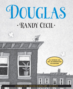
I was very excited about receiving this book. The premise hooked me in right away. When the book came, I noted on the cover, there was a blurb indicating that “all interior art will be reproduced in duotone.”
I have to also add, that I did receive an ARC-Advanced Reading Copy, so there was the possibility that what I was seeing in the ARC would change with final publications. I thought this wasn’t really a problem until I skimmed the pages looking at the artwork.
Definition of Duotone: “Duotone is a halftone reproduction of an image using the superimposition of one contrasting color halftone over another color halftone. This is most often used to bring out middle tones and highlights of an image. Traditionally the superimposed contrasting halftone color is black and the most commonly implemented colours are blue, yellow, brown, and red, however there are many varieties of color combinations used.” Wikipedia
So with all this information, I continued flipping through the ARC wondering the following:
Will the main characters stand out better?
Will the illustrations look less blurry?
Will the illustrations be more sharp and detailed?
Will the contrasting colorings be enough to lift the artwork off the page and give depth to its perception?
Will the story suffer from this illustrative idea?
The emotional impact of the illustrations for this reader, while reading were low, down, gloomy, glum, repressed, bored and disinterested. Will duotone properly fix all of these for future young readers?
The constrained artwork to a circular boundary seemed to cut the illustrations off. When the sentence below is read, a quick glance up to the accompanying artwork was disappointing. Will this change when young readers read the final publication that is using duotone?
This early reader is ideally perfect for young readers who struggle with reading/word identifying; older readers who read at a younger level; special needs individuals, or young readers who are beginning to read at a higher level. The story is adorable. It’s little mouse MC will warm any heart. There’s problem-solving, adventure, friendship, and more between the book covers. The artwork, is disappointing as it stands in the ARC. There are things that can be done to make it stand out more and be very effective in helping to drive the story to its final conclusion. Candlewick is known to produce great books, so we’ll have to wait and see if they change anything!
It will be interesting to see what a final production copy looks like. If the artwork improves, then “Douglas” will be a hit. If not, then I suspect readers are sure to be disappointed.
For this ARC, I sadly gave it:


